We may earn a commission when you purchase through affiliate links. Learn more.
Virtually all digital cameras including most modern point and shoots provide an exceptionally reliable method for evaluating proper exposure in your photos — the histogram. Camera screens and electronic viewfinders tend to make even underexposed and overexposed shots look great; when you actually pull them up on your computer later, you’ll sometimes find out that your exposure settings were way off! The histogram is the most accurate method for finding out if your photos have overexposed or underexposed areas, and it can even tell you whether your scene has high or low contrast.
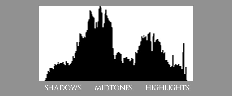
A histogram is a type of graph that, when used in the context of digital photography, displays a photo’s tonal range from dark shadows on the left side to bright highlights on the right side, with midtones in the middle. When you see a high spike on the diagram, that means that a large portion of your photo has pixels of that tone or shade — the more pixels in your shot that have that tone, the higher the spike will go. A photograph of a dark room with poor lighting will have a histogram that shows most of the tones distributed on the left. A photo of a bright sky with the sun in the frame will have a histogram that bunches up to the right with a sharp spike at the very right edge where the sun will likely have overexposed much of the image. To access this helpful feature, you can do so by pressing the info button on most cameras.
Every scene can be photographed using a virtually infinite combination of exposure variables, each resulting in an image that is visually appealing but that may have a very different histogram.
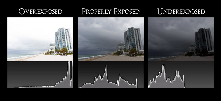
In the graphic above, we’re able to compare 3 photos taken of the same scene using different exposure settings. In the image to the left, we can see that the histogram shows that the vast majority of the photo is overexposed, with the graph spiking sharply to the right with no darker tones to the left at all. With an overexposed image like this, we’ve lost all detail in the sky. In the center, we can see a properly exposed image. Our histogram graph shows a pretty even distribution of tones, from dark on the left to brighter on the right. With an overcast sky, we have to be careful not to overexpose it, so we want to make sure that the graph isn’t spiking on the far right. In the underexposed image to the right, we’ve lost a lot of detail in the dark shadows and our histogram shows that the tonal range of the image is bunched to the left, with no brighter tones at all.
The histogram can also show us how much contrast is in an image. The wider the distribution of tonal range displayed on a histogram, the greater the contrast in our scene. A narrow histogram can show us that our scene lacks contrast, something that we may or may not wish to change by altering the exposure settings.
 In this image above taken with a Canon 5D and Canon 16-35mm f/2.8 L lens, it’s obvious when viewed on a computer screen that the scene is overexposed, with clipped highlights in the sky. In digital photography, clipping occurs when an image has areas of brightness or darkness which fall beyond the minimum and maximum intensity that can be recorded. In this case, the clouds in the sky have seriously blown highlights with no detail remaining. On the camera LCD display, this photo might look perfect though. A quick consultation of the histogram after taking the shot would show us that our graph’s tones are distributed heavily to the right, with low contrast and very blown highlights. To correct this in our next exposure, we might try lowering the ISO speed, using a faster shutter speed, or using a smaller aperture which corresponds with a higher f-stop number. Since there aren’t any moving subjects in the photo that would benefit from increasing the shutter speed, we’d probably be best off just lowering the ISO as much as possible and using a smaller aperture setting like f/16.
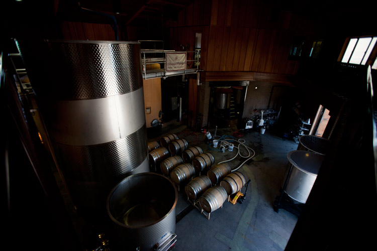
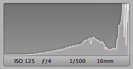
 This photo of a winery taken with a Canon 5D and Canon 16-35mm f/2.8 L lens is an example of an underexposed photo that looked fine on the camera display. We can see that our histogram graph is bunched to the left with a lot of underexposed areas of dark shadow. Even when shooting RAW, severely blown highlights in an overexposed image will never be recoverable. Underexposure is a lot more forgiving though, and using software like Adobe Lightroom or Adobe Photoshop would probably allow us to recover a substantial amount of detail in the underexposed areas of this shot. But, even though we might be able to rescue this shot, it’s always better to get it right in camera whenever possible, so we might try decreasing the shutter speed and increasing the ISO. We’ll need to keep an eye on the histogram though — that reflective metal looks like it would be easy to overexpose.
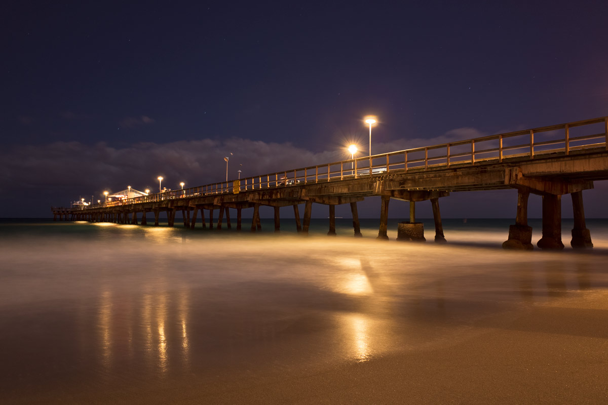
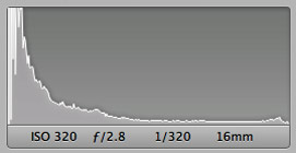
 Shooting long exposure photography at night can make it tricky to get a properly exposed photo. In the example above, taken with a Ricoh GR compact camera which has an APS-C sized sensor, we were able to make use of the histogram to get a properly balanced exposure. When shooting nighttime long exposures of a pier, we’re given a difficult lighting situation with both extremely dark areas and extremely bright areas; keeping them all properly exposed with details preserved is where the histogram comes in. You can see that the graph extends all the way from the left to the right of the graph. Most of the tonal information is concentrated to the left, but none of it is pushed against the edge, meaning that although it’s nighttime, we haven’t lost any details in the shadows. If we saw a sharp spike pushed against the right edge of the histogram it would tell us that we’ve got clipped or blown highlights.
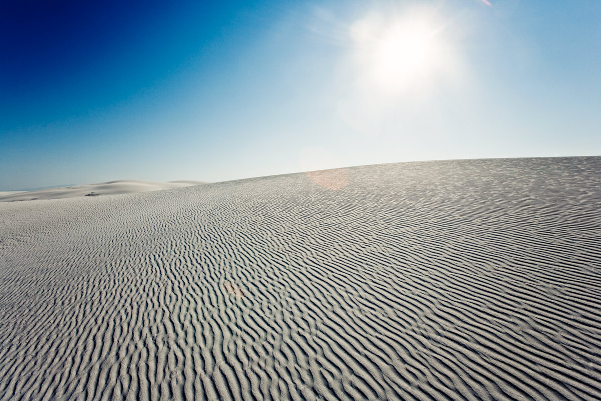
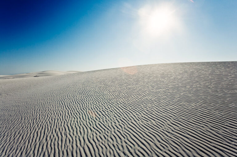
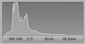
 This photo, taken in the blindingly white gypsum sand dunes of New Mexico’s White Sands National Monument with a Canon 5D and Canon 16-35mm f/2.8L lens was a tricky shot to expose properly. Our histogram shows us that we’ve got a very nice distribution of tones from dark to bright. Because we’ve included the bright morning sun in the sky, we can see that this has resulted in a few spikes to the right of the histogram, but there’s nothing to be alarmed about; the rest of the image is clearly properly exposed. Extremely bright days like this make checking the histogram especially necessary — even reviewing the image on the camera display to check the composition can be difficult in full sunlight.

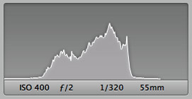
This photo of a conch shell sitting in the surf at sunset was taken with the Sony A7 mirrorless camera and the Sony Sonnar T* FE 55mm F1.8 lens. This kind of shot, with reflections and quickly changing light is very easy to either overexpose or underexpose. Relying on your camera to meter the scene correctly would likely result in incorrect exposure as well, so using manual mode in these tricky lighting situations is often the way to go. The histogram to the right shows us that the image has a good tonal range with more areas of shadow than brightness — exactly what we wanted since we wanted to show off the beautiful colors of the sunset reflecting in the wet sand.
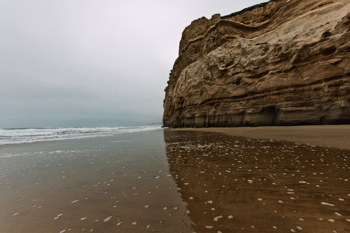
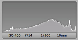
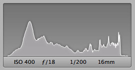 This photo taken at San Gregorio State Beach in California with a Canon 5D and Canon 16-35mm f/2.8 L lens shows us a scene that is exceptionally difficult for a camera to meter correctly. With a thick fog bank blanketing the sky, we’ve got a very low contrast sky that it’s extremely easy to overexpose. A consultation of our histogram to the right tells us that there’s a broad tonal range in this photo, with a good deal of shadows, but without any details lost in the dark areas. That narrow spike to the right represents the tonal area of the sky; it’s very narrow because of the low contrast nature of fog — there simply isn’t much tonal variation the way you would find with a deep blue sky dotted with puffy white clouds. Luckily, we can see that we haven’t overexposed the foggy sky. Even though there isn’t much detail to be had, we’ve preserved whatever there is — had we used a slightly wider aperture of perhaps f/14, we’d likely end up with a photo where our sky had blown highlights.