We may earn a commission when you purchase through affiliate links. Learn more.
Details in the brighter and darker areas of the photo are often lost when the exposure is off, and if you’re shooting in JPEG instead of RAW, there’s not much you can do to recover the lost tonal detail in these areas.
Evaluating whether your photo is properly exposed is next to impossible when you’re using your camera’s LCD screen or electronic viewfinder as a reference point, since it’s not designed for perfect tonal accuracy. At the lower resolutions found on most camera screens, even poorly exposed photos tend to look pretty good.
Digital cameras have a built in feature that makes it really simple to tell if a photo has any areas that are over or underexposed — the histogram!
A histogram measures and plots a digital photo’s tonal range and distrobution from dark black shadows on the left side to bright white highlights on the right side, with midtones distributed in the center. When you see a high point on the histogram graph, that means there is a high distribution of pixels of that tone in your photo. A photograph of a dark room with poor lighting will have a graph that rises on the left, with most of the tones falling on this side of the histogram. A photo of a bright sky with the sun in the frame will have a histogram with most of the tones distributed on the right with a sharp rise or spike at the very right edge of the histogram where the sun will likely have overexposed much of the image and resulted in a heavy distribution of pixels with bright tones.
Not only can you review the histogram on your camera screen after you’ve taken your shot — usually by pressing the Info button, but if you’re using mirrorless camera or live view on a DSLR, some newer cameras even display the histogram before you’ve taken the shot, basing it off of the current scene and your exposure settings.
There are scientific principles and properties of light that can’t be changed, but what you do with this light is entirely up to you as a photographer — there’s no perfect way to capture any photo. Even if you choose to steer clear of what most people would consider a good exposure to be, it’s still worth understanding how exposure works and since histograms can vary widely in how they look, it’s good to know how to read them.
Every scene can be photographed using a different combination of exposure variables, with each configuration resulting in an image that might look great but that may have a very different histogram. Photographs of a white, sandy beach will have a histogram graph that bunches to the right since the sand is white. A photograph of an insect on a black wall will have a histogram graph with most of the tones distributed to the left, even if the insect is perfectly exposed. For less extreme lighting situations, we’ll usually expect to see a histogram that stretches from the left to the right, sloping upwards near the center, without any sharp spikes on the far left or right.
In the following examples we’ll see some real world examples of how we can use the histogram to tell if our photography is exposed the way we want:
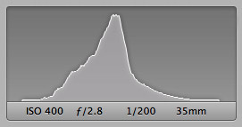 This photo of bromeliads has no loss of tonal detail in either the highlights or shadows, and you can see that most of the images pixels reside somewhere in the midtones. In a nice, even lighting situation like this without any particularly bright areas or dark areas in the scene this is the kind of histogram you might expect to see.
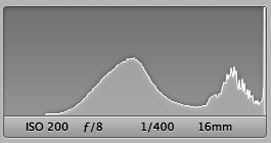 In this shot, the foreground is properly exposed, but the sky has blown out highlights. Almost all tonal detail is gone from the clouds – instead of seeing their puffy, cottonlike appearance, you simply see a bright white blob. In this shot’s histogram, seen to the right, you can see that while most of the graph is evenly distributed, the far right – representing the whitest areas of the image spikes suddenly to the top of the graph, showing us that the clouds are overexposed.
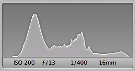 After looking at the camera’s histogram in the previous shot and seeing that the clouds had overexposed highlights in the white tones, we’ve adjusted our f-stop to a higher setting to let less light through the lens, resulting in a scene where both the foreground and the clouds are properly exposed! You can see in the histogram to the left that there is no longer an abrupt spike to the right of the graph.
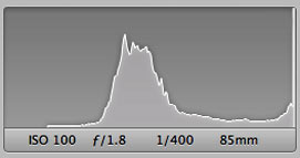 Sometimes the camera doesn’t share a photographer’s artistic vision. In this image taken at sunset in the Florida Everglades, the focal point is the grass to the right of the image. As you can see from the sudden spike to the extreme right of the histogram for this shot, the sky is technically blown out, with overexposed highlights, but in this example that’s what we wanted artistically, to contrast with the darker grass. As photographers, you have the option to disregard whatever the camera thinks is best, but to do so it’s important to know what the camera is trying to tell you so that you can choose to disregard it and follow your own vision rather than disregarding it out of ignorance. Rules are meant to be broken in photography, but it pays to know them so that you can break them the right way!
